
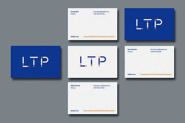
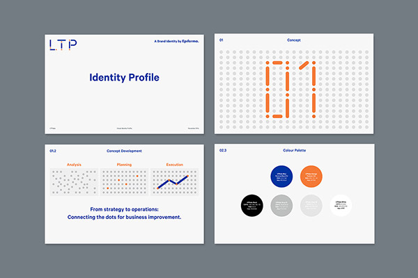
- LTP labsBrand identity, icon system and websiteLTP labs is a consultancy company focusing on strategy and business expertise through analytical methods for diverse sectors. As a startup company we were commissioned to help positioning the practice with a new brand identity.Our solution was to turn their three-letter acronym into an distinctive logotype with a bold personality. We abstracted the letterforms into reductive geometric forms. This consolidation of forms subtly references the nature of analytical data and aims to suggest ways in which parts work together to form a whole. This principles were all put together to set the brand motto: ‘Connecting the dots for business improvement'.In addition to the new identity, we created a new website design and a set of bespoke iconography used to illustrate the wide range of analytical services and industry expertise covered by the brand.


{{html comment}}
Discuss This Project: ( Comments)