Category: Behind the Project

Behind the Project: Silverblack WOOL Campaign AW15

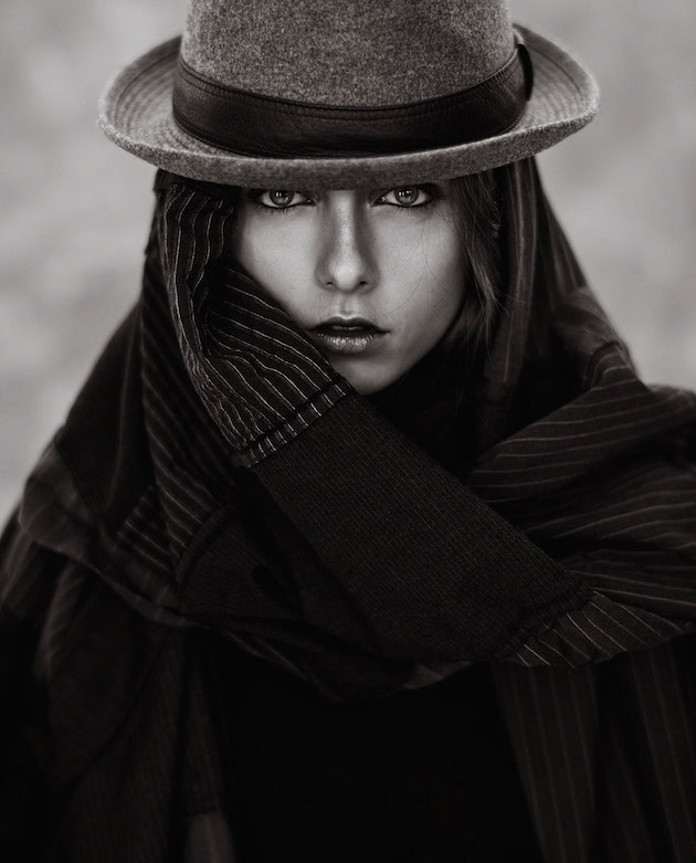
Starting off as a retoucher, Henrik Adamsen eventually quit his day job to become a professional fashion photographer.  We were lucky enough to get to know Henrik, the incredible artist behind the project, Silverblack WOOL Campaign AW15.  Find out why it wouldn’t be a bad idea to follow in Henrik’s footsteps, if you’re an aspiring artist.

Could you talk a little bit about how you started off as a photo retoucher and your development into a photographer?  What was that progression like?
It was actually a very long transition from being a retoucher in the mid 90s… Then moving to London and working there for a while as a retoucher, then AD-assistant / artworker, moving on into graphics design/ArtDirection, and somewhere in there I started shooting just for fun.  That then turned into something serious - so I kinda had to give up my day job. I just started getting too many jobs, that I either had to take days off to do, or to take care of them in the evening. In then end, it was the best decision I ever made - I highly recommend it!

0342270c3c5654f6b01771e7eb4df38f

Read more →

Behind the Project: Stolen Childhood | drawing series

Visual artist, Henrique de França, uses pencil and charcoal in Stolen Childhood | drawing series to reveal elements of his own childhood, as well as themes of Catholicism in Latin America.  Henrique was kind enough to share with us his process and inspiration for the drawings.  There were many drawings that he chose to not include in this project, and it’s safe to say that all of us here on Behance can’t wait to see them!

What was your inspiration for this project?  Is any of the subject matter in the illustrations autobiographical or inspired by personal observations?
This project is a collection of drawings I made throughout the last five years within the theme of memory. The subject, for me, automatically brings childhood to the center of the series, and although not biographical, I like creating images that resemble my own childhood and things I experienced when younger. The series also discusses themes such as catholic upbringing in Latin America, which I like to portray as a contemporary artist.

935404016e737af8f703917c6a7aafd8 (1)

When you set out to make these drawings, did you know how many you wanted in the series, and what they would each ultimately look like, or did it develop as you went along?
No, I cannot be sure of how many drawings I will have at the end of the series when I start it. I go with the flow and the need to explore the theme.

Read more →

Behind the Project: Moving Time

In this series, we’ll look deeper into some of the projects on Behance.net that are especially admired in our community. Gem Fletcher collaborated with Photographer Mads Perch to create the beautiful series Moving Time. Gem Fletcher is an Art Director who works with photographers around the world, creating award-winning photography, marrying highly conceptual art direction with the unique visual style of her collaborators. We were lucky enough to gain more insight into their project from Gem!

What was your inspiration for this project?
I’m really interested in the idea of destabilization. This takes different forms, sometimes it can be about creating an illusion, leaving the viewer questioning the construction of an image and sometimes it’s about exploring the tension between reality and fantasy.

9e01b8db94f7234086d0186b48548fed

With this project we wanted to play with using projection as a material, a method of transformation within the framework of a traditional portrait.

The project was something Mads and I had discussed for several months and although we had some specific technical and aesthetic ideas, we also wanted to leave room for play and exploration. Read more →

Behind the Project: Geografia mágica

In this series, we’ll look deeper into some of the projects on Behance.net that are especially admired in our community. Carlos Arrojo created illustrations for the book “Geografía mágica” by Ana Cristina Herreros. He is well known for his use of watercolor and design, and considers himself a versatile illustrator and a responsible person who knows how to adapt to each project. We were lucky enough to hear more about his process and inspiration for the illustrations.

What was your inspiration for this project? How do you decide which color palettes to use?
When I start a project, I usually review documentation looking for ideas. In this case it wasn’t so necessary because I relied on personal drawings done previously. Siruela contacted me after seeing some watercolors where I played with the ambiguity between figure and landscape, recreating spaces and volumes by weaving lines. The book is called “Geografía mágica” and contains a number of legends about Spanish geography, with anthropomorphic mountains, enchanted lakes, giants, demons, heroes…

The content is very inspiring so it facilitates me to do the job. About color, I’ve worked with a lot of freedom, leaving me. My intention was that colors of each illustration transmitted the magic and fantasy of the histories, that’s the reason of that coloring.

6ea22ca3b0c04d570fa00beab14e5d53 Read more →

Behind the Project: Anything Made of Paper

In this series, we look deeper into some of the projects on Behance.net that are especially admired in our community. Brandon Ray is a self-taught animator specializing in stylized paper-based animation. Since he launched Paper Brain Productions, the company has won five awards at various international film festivals. In 2013, he was asked to create the music video for Bill Carter‘s song, “Anything Made of Paper.” Read ahead for more information on his process and how he came up with his ideas!

1

What was your inspiration for this project? What does the story/song mean to you?
The inspiration for the project comes from the songwriters themselves, Bill Carter and Ruth Ellesworth.  The song was a gift they made for their friend Damien Echols, composed at a time in his life where he was waiting on death row, accused of a crime he didn’t commit.  Damien had sent Bill and Ruth three paper roses as a gift when his wife Lorri Davis was visiting them.  When Bill asked what he could give Damien as a gift in return while he was on death row, the answer was, “Anything made of paper.”  So that’s what inspired Bill and Ruth to write the song.  The hope we must cling to in the face of injustice. Read more →

Behind the Project: The Plague

In this series, we’ll look deeper into some of the projects on Behance.net that are especially admired in our community. Cihan Ünalan worked with art director Tolga Ozbakir to create The Plague. Cihan is currently an advertising photographer in Istanbul and Los Angeles. His passion began with bringing his heroes to life through photography, after being unable to find another medium that satisfied his thirst. We were lucky enough to hear about the process and inspiration behind The Plague from Cihan himself.

What was your inspiration for this project?
I think the most important thing with this kind of a project is finding the right team to work with. I was sitting on this concept for at least a year but I was having trouble in turning it into a series. It wasn’t until I met Tolga Özbakır, my partner in this project, that the idea for this shoot was properly shaped. I shared the materials and ideas I had for a possible shoot and we worked from there.

The Plague 1

In the beginning, we only had the Goggles and the Gas Mask in our hands, which I bought from San Diego Comic Con 2013. These materials had a steampunk design, so these little props were actually quite a lead for us to start with. We are both highly influenced from comic books, movies, concept arts and retro-futuristic designs, so we had a lot of common ideas for this project. I think its safe to say that the props led us down the path that we ended up.

Can you tell us about the story behind the project and what it means to you? Are there certain aspects of it that are open to interpretation by the viewer?
It’s funny because everyone interpreted something different when they looked at the project. All of the interpretations were more or less around the idea that there is a sickness going on, or someone was sick; and some others included that the girl leaves the man because he was working too much. Read more →

Behind the Project: Digital Vomit Pt 1

In this series, we’ll look deeper into some of the projects on Behance.net that are especially admired in our community. Alberto Seveso‘s passion for graphic arts started in the early 1990s, through his fascination with the graphics of skate decks and the album covers for metal bands. His project on Behance, Digital Vomit Pt 1, demonstrates the influence of these inspirations and how he has transformed them to create his own art.

What was your inspiration for this project?
The inspiration is something that surrounds us all; you can’t see it, but she can see us. Sometimes it appears and you have to be quick to grab it.

I’m surrounded by painters. I love painters. When I see beautiful projects on Behance done by a great painters, I want to be a painter! But I’m not a painter; I’m not good at drawing with pencils or brushes. I always admired people who can draw and paint for real.

Digital Vomit 3 Read more →

Behind the Project: Air Review

In this series, we look deeper into some of the projects on Behance.net that are especially admired in our community. Joseba Elorza is a sound technician turned artist who creates surreal illustrations through collaging techniques. He was recently asked to create video for the band Air Review‘s song “Young.” His use of images and layering creates impossible worlds through which a child runs. It is our good fortune to allow you to delve deeper into the making of the video, “Young.”

What was your inspiration for this project?
Air Review asked me to try to represent the road to maturity of a child and I thought that we could make that path literal and see a child running toward an uncertain future.

Air Review

The theme of childhood gives you a lot of freedom to represent dream elements. The surrealism usually found within my works fit in very well, so I tried not to limit myself and let the process where I search for the footage take me without a specific horizon.

There was not a clear particular source of inspiration, but the creative process itself ended up being the biggest inspiration possible, and in this sense the band gave me a lot of freedom to choose which way to take the project.

Can you describe your process in creating this project?
After establishing some guidelines and a main idea, I spent a lot of time searching for the right footage in public domain libraries. At this point, and given that I depend largely on what I can find out there, the original idea or the script can be altered by what I’m finding, making the whole process very natural and fluid in my opinion.

Read more →

Behind the Project: Michael Roulier

In this series, we’ll look deeper into some of the projects on Behance.net that are especially admired in our community. Michael Roulier is a photographer specializing in food and cosmetic visuals, having published more than 30 books in collaboration with three star Michelin culinary chefs. His project on Behance, Michael Roulier, contains photographs featured to help create a book for Anne Sophie Pic, a three star Michelin chef herself.

What was your inspiration for this project?
I was commissioned by Hachette, a French Publishing company to create a “sumptuous” book about Anne Sophie Pic, a French 3 star Michelin chef, a woman in a man’s world; an exception. Hachette knew very well that I would have to be left completely free on the creative part to accept a three weeks time project.

I had already worked with Anne Sophie, so we knew each other quite well. At this level, being a chef, means above all being an artist. This project was supposed to be her published food “manifesto.” The text was written by Stéphane Davet, a journalist specialized in rock & roll, but equally passionate about food.

The 48 images we had to do, like a true photography book, would appear naked, unadorned, and apart from the text.

Michael Roulier 2 Read more →

Behind the Project: Cinema

In this series, we look deeper into some of the projects on Behance.net that are especially admired in our community. Franck Bohbot is a photographer and visual artist, mainly focusing his artistic research on public spaces and urban landscapes. Each one of Franck’s series features certain photographic intentions — through their enigmatic atmosphere, documentary-style approach, and timeless feel. We were fortunate enough to delve deeper into one of his projects on Behance, Cinema.

What was your inspiration for this project?
For The Cinema Series, my principal inspiration was to honor the Art of Cinema by showing the atmosphere of movie theaters specifically in the state of California. Entering a Cinema instead of watching movies on your smartphone or computer gives a real emotion to the public. I think because of the new media, we are losing step by step, the pleasure to going to your local Cinema.

Cinema Read more →