
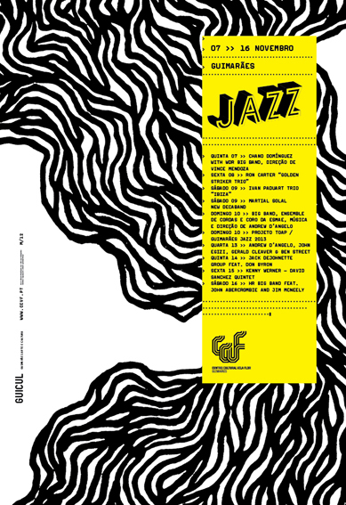
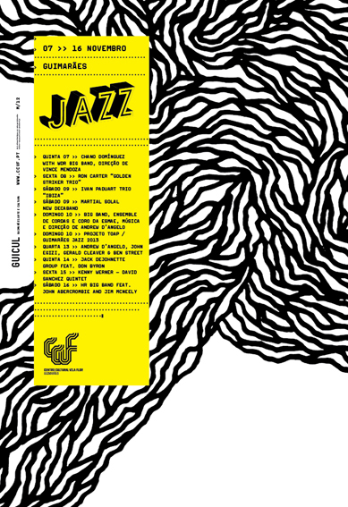
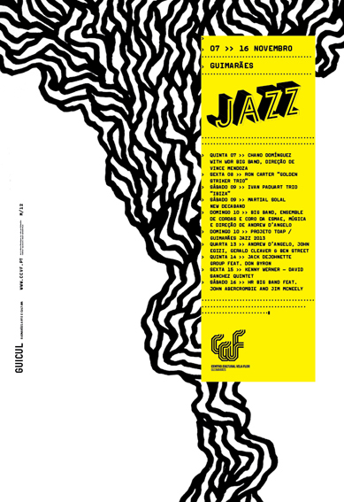
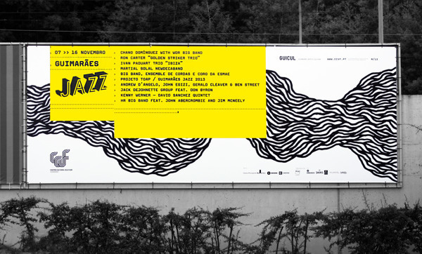
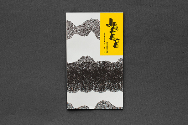
For the 2013 edition of Guimarães Jazz we went "Freestyle" with the graphics.
We felt like we needed to strip any ornaments or high details and dive straight
into expression.
into expression.
To achieve this, we've set ourselves into explorations of one basic element - the line, and the ways its sensibility could be translated into music, and its
sexuality into jazz music. Achieving some raw yet very powerful illustrations, we've then decided to overlay a strong yellow box with all the information over it,
so it wouldn't blend with the lines / music, but rather invade and label it, thus ultimately representing the festival.
sexuality into jazz music. Achieving some raw yet very powerful illustrations, we've then decided to overlay a strong yellow box with all the information over it,
so it wouldn't blend with the lines / music, but rather invade and label it, thus ultimately representing the festival.
- - -
Here are the results:
- - -
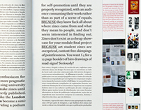
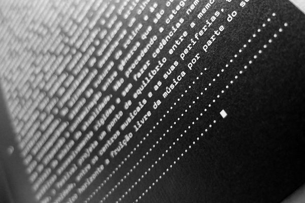
When it comes to the programme booklet, we've chosen a more mature approach. Keeping it on the raw side, we've actually wanted it to look like all the information - text and images, were interpreted by a machine, therefore digitizing and transforming its aesthetic. There's a certain emotional paradox regarding this style, as the text is set and layed out on a very cold and faxy way, and the warmth comes from an an even colder bitmap interpretation of the images, which gains expression when scaled up and toned yellow. It's actually the pixel that makes it look hot.
- - -
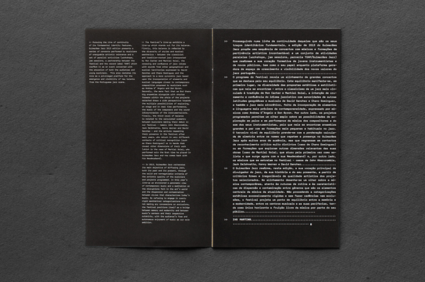
The book is designed with no cover, so the reader can jump straight into its content - as a way to highlight it as the most important part of this publication. It is made of two different parts, which are glued together and converted into a single and miscellaneous object.
On the first part, printed in newspaper paper, there's an explanatory and contextual text regarding the festival. Looking highly mechanic and typewrited, we wanted the first part to look like a play between highlighting and censuring information, telling the reader that he/ her is going through someone else's notes and interpretation of the text. We wanted it to look more like a draft than a final version of the contents.
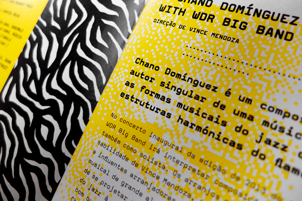
On the second part, printed in thicker yellow paper, there's the programme and further information regarding each artist / concert. In this part, there's a constant style tension between display (gestual) and book (mechanic), neat and
tidy vs blurry, typewriter vs halftone, full bleed vs balanced and white spaced. Jazz music is made out of tensions, between the musicians, the instruments,
tidy vs blurry, typewriter vs halftone, full bleed vs balanced and white spaced. Jazz music is made out of tensions, between the musicians, the instruments,
between the notes, the interpreters and the audience. That's what we want this
part to feel like.
part to feel like.
Thank You!