


- Porto / City Identity
and Branding ProposalInvitation from Porto City Hall - In June of this year (2014) we were invited, along with two other studios, to conceive a new visual identity for the city of Porto. We were given just 18 days to prepare a proposal, yet despite this, we responded to the opportunity with great enthusiasm and motivation.
Firstly, because we’re very passionate about Porto – it's our hometown and the place where we truly belong. Secondly, because we believe that design is capable of making a much stronger and more intelligent contribution to the city. We believe that visual communication can surpass the sometimes expected aesthetics of branding, and that it has the capacity to help create and to frame dialogue, acting as a mediator between a city and its inhabitants. What we show and explain below is our response to this challenge. - The Brief• To design a new identity and communication strategy for the city of Porto, Portugal.
• To communicate a young, energetic and cosmopolitan city – for inhabitants and visitants.
• To blend the communication of the city hall within the communication of the city.
• To conceive a system able to communicate both the city hall, as an institution, as well as its six municipal companies responsible for the management of a wide range of services, from water distribution to cultural planning.
• To present concepts and strategies for renewing the city’s digital communication, web and mobile. - The challenge it presented• Learning more about Porto. Studying its history, including the history of its graphic representation.
• Understanding the administrative structure of the city hall in order to propose a communication system that facilitates its functioning both for the institution and the inhabitants.
• Creating a solution that is bold, intelligent, original and integrated, able to reach a broad audience and communicate with the diverse socio-economic and cultural contexts of Porto.• Designing a wide range of materials in order to test the broad effectiveness of the possible solutions — from a logotype to a city branding campaign, from personal stationary to large scale outdoors, from print to digital.• Dealing with time constraints — 18 days from the briefing to the presentation.
• Designing for what you love the most – Porto is our city and our sentiments towards it are not always easy to describe or explain. This is a highly motivating factor – it increases the level of our ambition, raises our expectations and standards, and ultimately the sense of pressure. - The teamWe love to work collaboratively. It runs in our blood, and has been one of the core premisses of the studio throughout the years. Working on such a big project involves spreading talent and thought through different areas and different problems. This provided the perfect opportunity not only to put us to test, but to work with some creatives and friends we’ve wanted to collaborate with for a long time. Therefore, we assembled a very talented multi-disciplinary team who worked tirelessly on the proposal. We are very grateful for the amount of effort and dedication each of them has put into this project, and are absolutely thrilled by the quality of the outputs we’ve produced together.
- The processHaving such a big and talented team we encouraged ourselves to simultaneously explore a variety of approaches whilst establishing common visual areas of interest. All ideas were tested visually and discussed and those that showed promise were fine-tuned for further discussion.
- A historical perspectiveThe city of Porto dates back to the Bronze Age, and has been a key location throughout the history of Portugal.Having been through a lot of different stages and influences since its foundation, its physicality clearly reflects its origins on the banks of the Douro river, cascading all the way up to its high points. The city itself has approximately 200.000 inhabitants, is the capital of its district, forming — with its adjacent municipalities — a single urban area with 2 million inhabitants, the largest in the northwestern part of the peninsula.It is known as the “capital of the north” for its history, its entrepreneurship and work capacity alongside a tradition of underground cultural movements and activism. Porto takes pride in its city, its inhabitants and its tittle of “Undefeated, Highly Noble and Always Loyal”, being a good example of history and modernity, tradition and hipness blended together.
- Approach #1• Porto’s topographic and hydrographic characteristics have always been decisive in the definition of the city’s personality. Considering the dominance of the river as a territorial reference and the varying and characteristic elevation of the city, we were attracted to the idea of exploring the connections between different elevation points in the city in relation to the location of the river.
• In parallel, we needed a conceptual trigger in our search for visual forms and shapes that could serve as the basis for the identity. Creating these forms through an expressing of the city’s physicality seemed an interesting possibility. The idea was to generate a series of visual folds formed by an imagined intersection of two or more points related to elavation. It is a location driven idea, enabling the creation of an endless array of shapes depending on the geographic position of an individual, building or institution.
Despite our high interest in this concept and the powerful graphics
we were generating, we felt the connection between the visual language it was producing and its conceptual source of origin could be difficult to comprehend without the unique insight we had as authors. 
- Approach #2 – The heraldic legacy• Porto is a city full of history, a value in which its citizens take great pride. Its architecture is a significant part of its legacy, with buildings ranging from Romanesque to Manuelin, Baroque to Art Deco, Medieval to contemporary. A lot of these historical buildings display the city’s coat of arms on their façades, as a way of exhibiting nobility.
• The city’s coat of arms, in its current form, displays the Portuguese as well as Porto’s original arms. We were particularly attracted to the way both sets of symbols are symmetrically repeated, and considered that it could be interesting to explore this concept of symmetric repetition and heraldic graphic hierarchy using contemporary versions of the city’s iconic landmarks. Basically, we speculated about what a contemporary heraldic system could look like if designed today.
Again the graphic results were interesting. But we feared it could project an erroneous view of the city, not simply because Porto is known as a Republican bastion but also because the coat of arms as a visual form carries too much historical and cultural weight. - Approach #3• When designing multi-faceted identities, an almost inevitable conceptual cliché is the exploration of pictograms as a form of representation. There is a graphic simplicity and apparent conceptual order to this approach that appeals to the graphic mind. It was not our preferred starting point but neither was it a route that we felt we could dismiss out of hand. And so we experimented.
• Drawing inspiration from the many iconic buildings, architectural details, and cultural and historic references of the city we rapidly constructed a diverse array of stylized pictograms.
Many were pleasing as simple graphic forms. But we soon realized however that we had inadvertently been drawn into a graphic Disneyland, where the complexity, variety and dynamic discourse of our city had been reduced to a homogenised, stylized and almost infantile banality. We discovered that an attempt to impose a graphic order resorting to the use of pictograms had in fact robbed our desired identity of any ambiguity – and the loss of ambiguity is inevitably accompanied by the loss of interpretation. Furthermore, we felt that the fixing of meaning that such a literal and conceptually reductionist system constructs would become tiresome, unable to reflect the richness of representation and reflection we desired. - In the end we did conceive and print two nice silk-screen prints out of these illustrations.Just for fun. :)
The Solution
- Deep into our development of the concept it became clear to us that our exploration extended beyond the specific goal of creating an identity for Porto. It inevitably involved asking in what ways is was possible for visual communication to reflect and represent a city – any city.We had embarked on a journey – a journey that implied more than choosing what vehicle to use – but thinking about the very nature of transportation.
That questioning led us to a philosophy – how we understand identity. In turn the philosophy suggested a methodology – how we have chosen to assemble the visual components for an identity by creating a graphic vocabulary.
Finally, the strategy – how we propose to use that vocabulary.
Those three elements: philosophy, methodology and strategy, form the basis of our approach. - Our idea of a visual vocabulary consists of a rich and diverse graphic lexicon that can be expanded and used in a diverse number of ways. It deliberately embodies a degree of abstractness. It forms the basis of the identity, and addresses all the constituent parts of the city.
- We divided its usage into two different voices that the city uses to speak with its citizens.
1 For the Câmara Municipal and its elected body
1.1 For the services it offers
2 For how the city speaks about itself, from the inside and from the outside.
- Even though both types of communication resort to the same visual vocabulary, whenever the City Hall communicates, its graphic mark displays an organized layout framed by a shield protecting the city core. On the other hand, whenever the City of Porto communicates, its identity no longer displays the shield, and can resort to a dynamic and multicolor composition system.
- 1. CM Porto / Institution
- 1.1. Services
- 2. Porto / City
- We have also developed an application that is able to automatically choose which graphics of the alphabet to use or overlap and color scheme depending on the category and season of the year.
- We have designed a box set containing some elements of the new identity, where the City Hall and the City of Porto blend in a single object: a book with the graphic vocabulary; a set of letterpress printed postards; and a set of personal cards
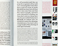
- Web / Mobile communication• Finding information on the city hall’s current website structure is a complex and sometimes unrewarding task. There is a given set of bureaucratic rules that condition the structuring of information that ultimately generates confusion for users.
• We came to the conclusion that navigating in the current web system was chaotic – for the city inhabitant and for tourists. Therefore, as a consequence of the new communication structure we planned for the city hall, we divided information into five broad categories:
• Porto Town
• Porto Services
• Porto Social
• Porto Culture
• Porto Tourism - This organisation format is key for the new web navigation and codification, leading to a solution where a search bar becomes the core component of the page – as if the city hall had its own private google – supported by a hidden option of traditional menu navigation. In this way, we managed to eliminate most of the superfluous information, enabling users to encounter the content they desire.
- • The same concept and navigation premises were used for mobile devices, with an obvious design adaptation for smaller screen sizes.
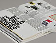
- Campaign slogans and poster
for both locals and tourists
What we are presenting here is not a final piece of work.
It is a visual concept that proposes a new way of organising the communication of the city and city hall, one that
we believe is suited to Porto’s personality, history, and most
importantly, its future.
Porto / City Identity and Branding Proposal
- 61729
- 4648
- 277

{{html comment}}
Discuss This Project: ( Comments)