
Enthusiasm As a result of the relation between our studio and ESAD, Matosinhos' school of art and design we were again involved in the production of the latest double issue (2-3) of Pli * Arte e Design. Named after the concept formulated by Gilles Deleuze, Pli is a magazine about contemporary design and critique, developed around a network of collaborations between various international thinkers and authors, in an attempt to explore new, relevant and processual narratives to the fields of art, design and architecture.
This issue is themed around “enthusiasm” and its role in the contemporary project and intellectual culture, (a brave choice for these rough times). So, we got an immediate motivation by the opportunity to take this motto and make something special.
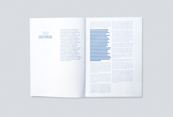
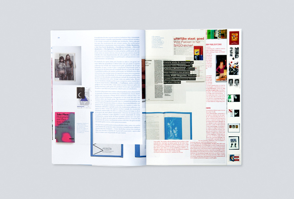
While defining its dimension and styles for every format and article, our main preoccupation stood on an attempt to make it easy to read and cross information. Therefore, text should be read as easily as in a book, and images as if they were in a catalog.
There was an obvious objective to make the object fun and alluring. Mostly, we wanted the readers to enjoy and get surprised by the experience of navigating through the contents of this publication as a statement of the potentiality of the printed and editorial matter.
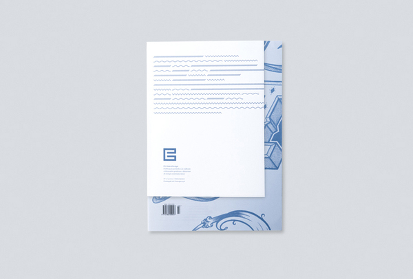
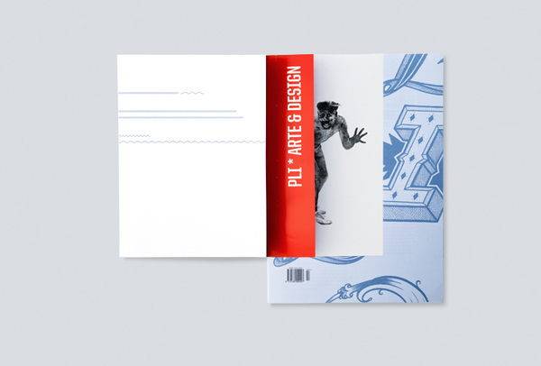
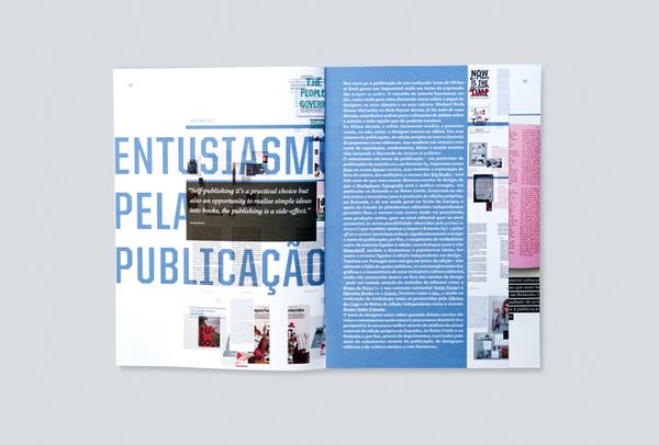
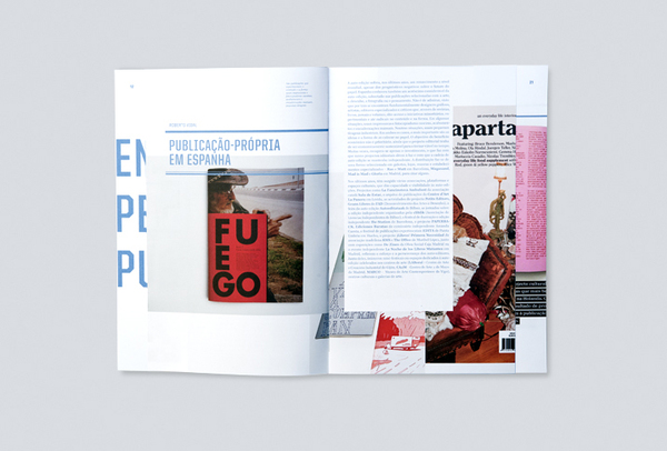
This magazine is the result of an exploratory exercise about alternative narratives in print. There was an intention to use format, paper and sequence so that the different articles could be contaminated by each other, as it happens in a round table conversation or debate, as well as by an hyperlinked way of reading as we're now used to practice on the web. The articles become shuffled and eventually blend, united by its themes and separated by their format.
Our approach was similar when concerning style, making it possible, by the turn of a page, for the readers to transform chaos into order, the typical magazine pagination into a book layout, zoom into the photographic contents or change its graphic style according to the articles' own thematics.
This issue is themed around “enthusiasm” and its role in the contemporary project and intellectual culture, (a brave choice for these rough times). So, we got an immediate motivation by the opportunity to take this motto and make something special.
As we were getting hands on with the texts and images, and more familiar with topics they addressed, there were some desires and preoccupation we felt should be visible in the making of this magazine:
• Complex Navigation, yet Easy Reading
• Show them raw, but show them well. (Allow contents to speak for themselves.)
We quickly got to the point of assembling rough models based on free guesses on how much pages would each article need, in order to start to assemble an identity for the publication as a whole, and then started to set up some common styles and principles to keep it easy to identify the mechanics of its reading.
To do so, we've decided to resource to a complex structure of paired booklets, contemplating three different formats and sizes (plus one more for the outside cover).
While defining its dimension and styles for every format and article, our main preoccupation stood on an attempt to make it easy to read and cross information. Therefore, text should be read as easily as in a book, and images as if they were in a catalog.
There was an obvious objective to make the object fun and alluring. Mostly, we wanted the readers to enjoy and get surprised by the experience of navigating through the contents of this publication as a statement of the potentiality of the printed and editorial matter.
Atelier Martino&Jana
Editing
ESAD,
School of Art & Design,
Matosinhos
José Bartolo
Sérgio Afonso
School of Art & Design,
Matosinhos
José Bartolo
Sérgio Afonso
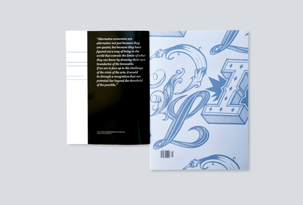
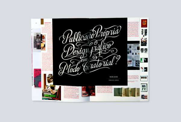
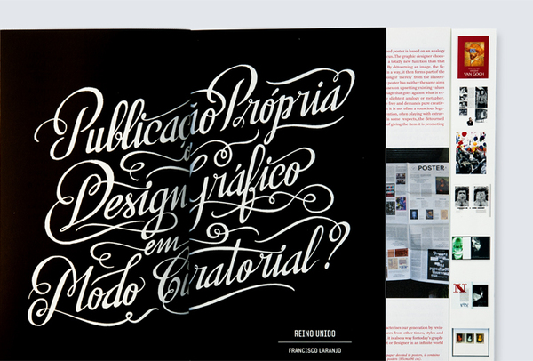
Lettering
Hugo “Xesta” Moura
Thank You!